October 30, 2013

paint


I paint.
Paint is what I use to pay attention to the world.
Earth and oil; sometimes buttery, sometimes grainy, gritty.
But it's a medium--a via--a path toward representing how I see.
Why hide it: these clumps and drips and ridges and smears?
the holy family no. 24

October 4, 2013

what does love see?


"meditation on Rembrandt's Portrait of Vaters" conte and pastel on paper. 22" x 30"


Modernism’s eye can be unkind. I think of Diane Arbus’ crisp clean portraits of the world’s strangers. To me they feel clinical, curious and detached.

But love’s gaze must be equally specific. Love doesn’t generalize.

I see this man: lines extending from his mouth to his jaw; wrinkles around his eyes when he smiles; the hollow in his neck just behind the left jaw; the way he blinks and stutters just a bit; the way he rolls the “r”s when he says “corrida.”

To me the portraiture of love is not generalized; does not cover over the particular or the blemished or the scarred—because these are the very features that identify this particular person and which—in love—are more important than some abstract, ideal view of beauty or elegance.

September 27, 2013

"Analyzing Portraits: Obtaining A Glimpse of the Self" by Dylan Cullen


Dylan Cullen wrote this essay in response to a drawing I did recently. I like the way he thinks with the image; the way he allows the art to guide his examination of what it means to be alive.

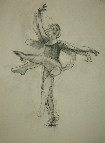
"glimpses no. 1" conte on paper. 22" x 30" 2013


When I think of the self, I acknowledge that it is a process and not a product, an abstraction and not a reality; a developing truth that feeds off of fear and yearning. Straight from the womb we are blank canvases, and yet life experiences, the trials and the triumphs, add strokes of various colors, textures, and intensities upon who we are. Mark Horst, an artist from Albuquerque, New Mexico works synergistically with his paints as a way of pointing towards “the fleeting, the glimpsed, to[wards] the life that is always present and so difficult to touch” (Horst). Through his portrayal of a young man in a drawing entitled Glimpses No. 1, Horst explores the incomplete and dynamic nature of portraiture and, by extension, the self. For Horst, painting provides “an invitation to explore the world and ourselves” (Horst), and his work provides us with the opportunity to capture glimpses of ourselves through the portrayal of others.

As I look upon the piece, I appreciate Horst’s authoritative command over light and dark, his ability to carve the boy’s features and emotions out of nothingness, his choice to convey more than what is conceivable through the omission of color. The pastel drawing appears to follow the progression of a boy’s identity over a condensed period of time. One could argue that Horst began to sketch the boy and became dissatisfied with the portrayal, thus moving over on the page to try again. This correlates to our opinions of ourselves: we hold ourselves to certain truths, grow to find those truths inaccurate in the current moment, and must begin once again the arduous pilgrimage of self discovery. While the two sketches of the boy can be considered very similar, the slight variations in shadow, smudging, and shape suggest that we do not necessarily always change drastically, however, we are forever changing in minute ways as if we are constantly struggling between a comfort with who we are and a desire to be someone else.

By giving the work of art the name Glimpses No. 1, not only does Horst admit that his drawing represents a mere fraction of the boy’s identity, but he concedes a volatility to his work: the boy’s identity will change over time, and so will Horst’s perceptions of the boy. Additionally, the drawing is simply Glimpse No. 1 in a series of snapshots to come and is by no means a definitive portrait. We see this straightaway through the artist’s two drawings of the boy on the same piece of paper, the second portrayal being more complete in some ways and more starved in others. The medium that Horst chose to use for this piece is also very telling about the journey of the self. While Horst mentioned his love for painting in his biography, he chose to draw this piece using pastels. As exemplified by the artist’s use of pastels, some parts of ourselves are stagnant, for example one’s overall sense that they are a continuous entity, while other parts of ourselves are smudged, erased, and altered over time. Horst’s use of pastels, a delicately magnetic medium, symbolizes the depth of identity and its subsequently dynamic nature. Additionally, pastels produce very honest colors: out of any artistic medium, the pigments produced by pastels are most like those found in nature.

The self can be thought of as an agglomeration of shallow pools, each one holding a tiny portion of one’s existence. When brought together, however, these pools form a murky pond whose depth is uncertain and whose terrain is vastly unexplored. Searching for a definition of human identity in Horst’s drawing is vague, transitional, and looks different through each of our eyes. Similarly, searching for ourselves in such places takes time, patience, and a willingness to unearth the unknown. Horst’s artwork lets us know that who we are as humans is not defined by how others perceive us, nor by who we are in a singular moment, but rather by a carousel of selves that we accumulate along the path of life.

August 7, 2013

painting and life no. 2

one of Francis Bacon's screaming popes.


“everything that’s alive is in motion”

Any painting that hopes to bring life to an image must do more that accurately represent a subject. But this idea of motion does not mean that an image cannot be balanced or centered. A spinning top is in motion but it doesn’t wobble until it’s ready to fall.

I’ve had a fondness for paintings that blur an image, but I think it’s a mistake to assume that blurring is the only way to represent the motion that goes with life.

In fact, Francis Bacon’s blurring of faces, seems to me to be something like a top in it’s final rotation. His faces are distortions of life, intimations of anguish or death.

August 5, 2013

all is a procession...


(All is a procession,
The universe is a procession with measured and perfect motion.)

from “I Sing the Body Electric” Walt Whitman

painting and life no. 1


“Everything that’s alive is in motion…”

When painting works, it brings life to an image. When painting fails, it pins an image like a specimen to the canvas.

This is one of the ways I can evaluate my own work: when I sense a presence there… when I see someone looking back at me, when some world begins to breathe…

I love accuracy and precision and care, but without this sense of vital energy a painting fails its most basic assignment.

J. K. Rowling and the commercial side of painting no. 2


"I hoped to keep this secret a little longer, because being Robert Galbraith has been such a liberating experience! It has been wonderful to publish without hype or expectation and pure pleasure to get feedback from publishers and readers under a different name… And to those who have asked for a sequel, Robert fully intends to keep writing the series, although he will probably continue to turn down personal appearances." J. K. Rowling

J. K. Rowling’s experience with her pseudonymous author says something else to me about the commercial side of painting.

One of the things that galleries look for is a recognizable and consistent painterly voice. Often this means that if a gallery brings an artist in as a figure painter, they want the artist to continue painting figures—and these in the manner they’ve come to recognize. This all makes sense from a marketing point of view.

But it can be death to art. So much about art making is playful and exploratory.

So, whether you change your name or not, it’s crucial for the painter to paint as if  she is free of the demands of her painterly identity.

If painting isn’t at least partly about freedom and breathing in the big, spacious, open world, it isn’t worth much.

July 16, 2013

J. K. Rowling and the commercial side of painting no. 1


This week J. K. Rowling admitted that a mystery novel published last year was indeed her creation. Apparently at the point her identity was revealed, the novel had sold 1,500 copies.

This makes me perversely happy in that it points out that commercial success and quality work have virtually no connection.

Paint on!

April 23, 2013

the risk of seeing


“I don’t try to be prophetic, as I don’t sit down to write literature. It is simply this: a writer has to take all the risks of putting down what he sees. No one can tell him about that. No one can control that reality. It reminds me of something Pablo Picasso was supposed to have said to Gertrude Stein while he was painting her portrait. Gertrude said, ‘I don’t look like that.’ And Picasso replied, ‘You will.’ And he was right.” 
James Baldwin

April 10, 2013

where the artist comes in


a drawing by Rembrandt


[The artist] must show people more—more than they already see, and [she] must show them with so much human sympathy and understanding that they will recognize it as if they themselves had seen the beauty and the glory. Here is where the artist comes in.
Charles Hawthorne

January 30, 2013

Martin Shaw on the paintings


Here are some kind words from an articulate painter/story teller friend of mine:

Mark Horst carries a quiver full of painterly gifts. His startling work reveals wild pinpricks of the eternal, often in the subtlest of images. Make no mistake, the paintings sometimes hold our feet to the flame-a door between a collectively understood image and some new paint-spirit that comes hurtling through. Not always a comfortable experience.

That door is also a gateway between the tacit and the explicit-his sheer feel and technique is obvious, but there are other energies at work here too, some ancient condition of the soul.

Horst is one of the few new painters to hold the paradox of tradition and innovation within him- there is brilliance here.

MARTIN SHAW, author, teacher and painter.

January 16, 2013

thoughts on painting from Mike Kareken

Michael Kareken, "Auto Salvage Yard #6", 2012, 18" x 24"


I studied painting with Michael Kareken at the Minneapolis College of Art and Design over five years ago. From that distance, these are a few of the extremely helpful comments I remember him making and which often echo through my studio when I’m working.

1. When you’re up against an empty canvas, pick a color and start. “Don’t over think it.” When I was feeling anxious about starting a painting—this was so helpful.

2. “Cover the canvas as quickly as possible.” I remember MK saying this to us when I put down a few strokes and then started worrying about whether they were accurate. 

3. When mixing color, don’t go overboard. “If you need to use more than three colors (from the tube) to get where you’re going, start over.” This was so helpful to me

4. If you’re not sure where to go with the painting, “start another painting” just like it. That way you can try out the direction you’re contemplating. I found this to be one of the most enormously helpful and liberating habits in my painting practice.

5. Kareken said to me: “paint what you think looks good”. if you like a photo, what is it you like about it? Paint that.

Most of these comments relate to MK’s fundamental insight that painting is a relational practice. You can’t paint the painting in your head—get paint on the canvas. A mark can’t be perfect outside the context of all the other marks on canvas. A color can’t be right or wrong in the absence of other colors so don’t fuss.

I think the other basic insight here is that painting is a process and that you need to eliminate—ruthlessly—any thoughts or habits that get in the way of keeping the process moving. There’s nothing precious about the painting itself and you could paint it again and push it in another direction or just start over.

For me, this was great teaching.

Michael Kareken, "Suspension", 2012, Ink, 30" x 36"

January 9, 2013

some quiet paintings


"I.B. looking in" 14x18" oil on canvas


In November I finished a group of smaller paintings. I wanted them to be small and intimate, to have a quietness. So, at least at the beginning, the colors were pretty calm and the edges pretty soft--sort of a modernist reference to Vermeer. I had to use smaller brushes then I have for a long time—so that was good. I had to paint slowly and for some reason I didn't get tired of the work--which sometimes happens to me. For the first time I had paintings framed. I wanted to shelter the image, to protect it's solitude. I notice that as I painted the colors got stronger and the edges harder, as if I was reverting to some kind of painterly habit.

"I.B. looking out" 14 x 18" oil on canvas.


I notice that as I painted the colors got stronger and the edges harder, as if I was reverting to some kind of painterly habit.

"I.B. with avocados" 14 x 18" oil on canvas.


Followers